The housing market is an area of major importance to the financial system, as loans secured against real property account for a large share of the total balance sheets of credit institutions and households. Hence, developments in the housing market are closely monitored by the Council.
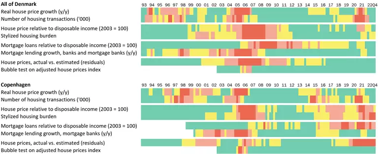
The Council applies information from a variety of data sources when assessing risks in the housing market. To obtain a simple, visual overview of various risk factors, the Council has developed a "heat map". The heat map is shown in Chart 1 and along with other relevant information it is included in the Council's assessment of whether the state of the housing market requires implementation of initiatives to counter the build-up of risk. Typically, the Council tends to issue warnings or recommendations when several indicators deviate considerably from their historical benchmarks and when the risk picture in the housing market is supported by other market and supervisory information.
| Heat map |
Chart 1 |
|
Note: The latest observations are from 4th quarter of 2022. The indicators related to households’ incomes are heavily affected by the early payment of withheld holiday funds in the 4th quarter of 2020. See the descriptions of the indicators in section 2. The colours reflect the values of the individual indicators relative to the values for the whole period for which data is available. The 10 per cent highest observations are assigned red, the 10 to 25 per cent highest are assigned orange, between 25 and the 50 per cent yellow and otherwise green. For the bubble test, however, a significance of 1 per cent is red, 5 per cent orange, 10 per cent yellow and otherwise green. For Copenhagen City, lack of data means that slightly different definitions and shorter history have been used for certain indicators. Copenhagen City includes the municipalities of Copenhagen, Frederiksberg, Tårnby and Dragør.
Source: Danmarks Nationalbank, Statistics Denmark, Association of Danish Mortgage Banks and own calculations. |
The Council has a number of instruments at its disposal that may affect different aspects of the housing market. For a review of potential instruments, see the Council's discussion paper on the real estate market.[1]
1. Description of the heat map
The heat map contains quarterly observations for Denmark overall and for Copenhagen City viewed in isolation. Copenhagen has been selected because both Danish and international analyses have shown that developments in capital cities tend to ripple through to the rest of the country with a lag.[2] So if developments in Copenhagen show a tendency for risks to build up, this could be an early indicator of the build-up of more general risks if they spread to other cities and areas in Denmark.
The heat map has four dimensions, each with two indicators. In that way, it is ensured that the visual overview is not blurred by overlapping indicators. The intuition behind the choice of dimensions and indicators is described in section 2. The four dimensions are:
1. Activity in the housing market
2. Debt servicing
3. Housing credit
4. Empirical models
Data from 1993 onwards is used, with data being added as it becomes available. 1993 has been selected as the baseline year as this is the first year with sufficient data for Copenhagen City. The baseline year will remain the same as new observations are added.
Each observation is assigned a colour, reflecting the value of that quarter relative to all observations for the indicator in question – the more extreme the observation, the warmer the colour on the heat map. The colour of each observation depends on both historical and future observations. Each observation may change colour over time as new data points are added. Note that the colours refer to the build-up of risk. When risks materialise in the form of e.g. plummeting house prices, the heat map often turns green.
The heat map has an inherent tendency to underestimate current risks, cf. also the sensitivity calculations in Appendix 1. For example, the extreme levels for several indicators around the mid- and late 2000s entail that subsequent high values for these indicators are not displayed as alarmingly high. This is because the heat map always has only 10 per cent critical observations (red), which are basically "reserved" for the extreme observations in connection with the financial crisis. For the heat map to turn yellow, orange or red in Copenhagen City, annual house price rises of 9, 14 or 20 per cent, respectively, are required. For Denmark overall, the corresponding figures are 3, 8 and 11 per cent. Conversely, an indicator that fluctuates only little over time and hence reaches a critical level relatively seldom will be "forced" to turn red for 10 per cent of the observations. This can result in false danger signals.
2. Choice of indicators
The choice of main indicators for the heat map was based on several considerations. Besides a relevance criterion, it was important that data for each indicator was available sufficiently far back in time and that data is published on a quarterly basis and with a relatively small lag. The Council also includes supplementary indicators that do not meet the data criterion in its assessment of the housing market.
Authorities in other countries also apply indicators and heat maps in their assessments of the national housing markets. For example, the Bank of England publishes a set of indicators that are to some extent the same as those chosen here. The Banco de España has also published indicators in a heat map with percentiles very similar to those shown in Chart 1. Both countries also use supplementary information, and neither has laid down a priori rules for when initiatives should be implemented.
Time series for each indicator are presented below, along with a short description of the underlying intuition.
2.1. Activity in the housing market
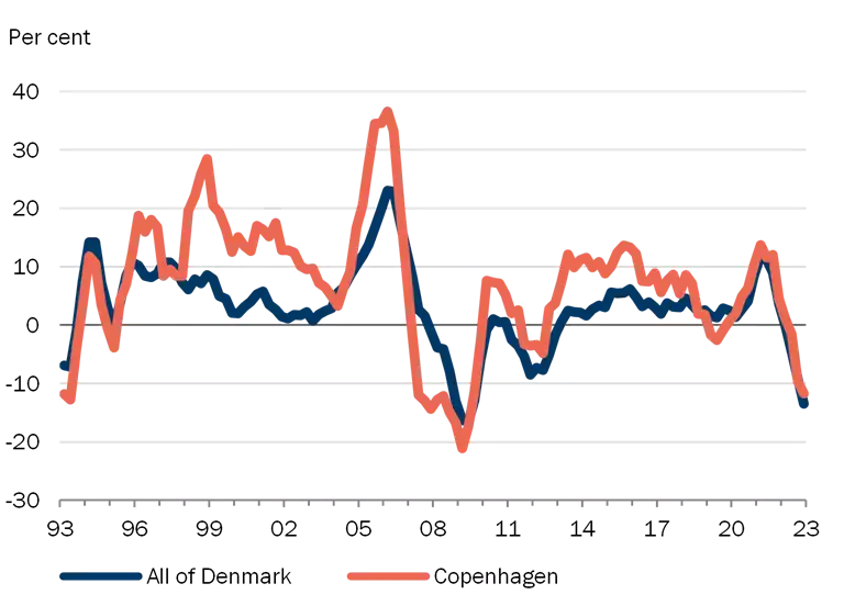
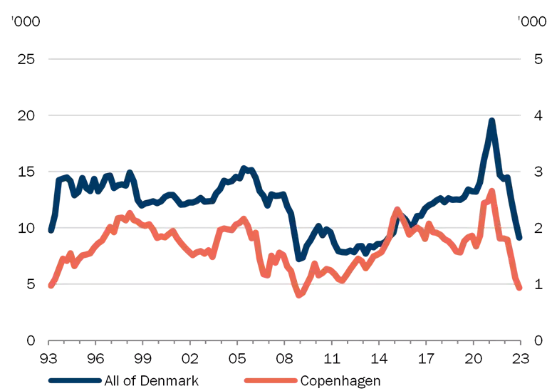
This risk dimension includes indicators for real house price growth and number of sales.
Intuition: A hike in house prices increases the risk of a subsequent plunge, with potential systemic implications, given that real estate serves as collateral for loans and as a store of wealth. Hence, rising property prices may be an indicator of the build-up of systemic financial risks. High trading activity may point to an overheated housing market where buyers seek to enter the market before it is too late. In combination this may create a self-reinforcing spiral with buyers acting less prudently.
| Activity in the housing market |
Chart 2 |
| Real house price growth (y/y) |
Quarterly number of housing transactions |
|
|
Note: Seasonally adjusted. The most recent observations are from the 4th quarter of 2022. Left: Deflated using the consumer price index. For Copenhagen City, owner-occupied flats have been applied; for Denmark overall, single-family houses.
Source: Statistics Denmark. |
2.2. Debt servicing
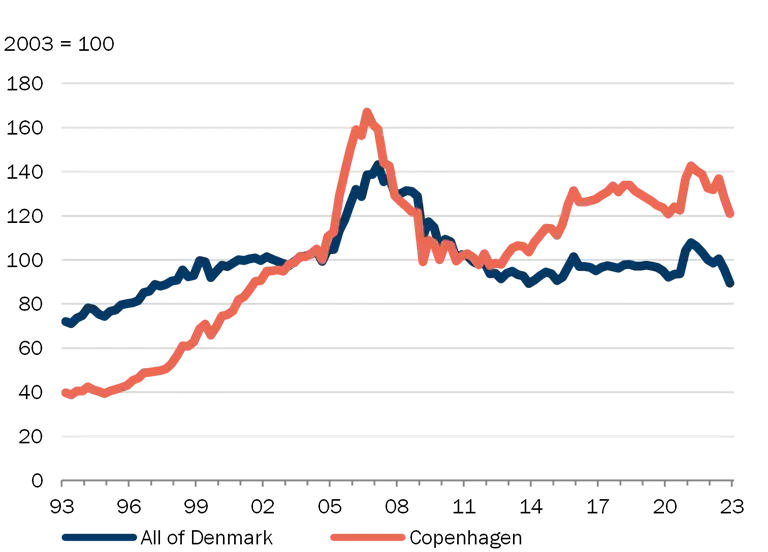
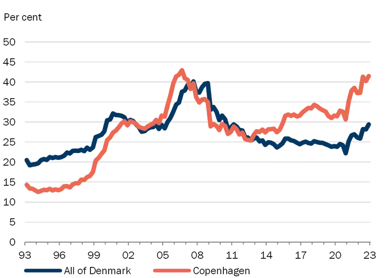
This risk dimension includes indicators of house price relative to disposable income and a stylised housing burden.
Intuition: Overoptimism about future prospects and risks related to acquiring real estate may lead to high pricing relative to economic developments in general. To the extent that a large share of the financing is with a short fixed interest period, systemic risks may arise if borrowers do not to a sufficient degree take the risk of higher interest rates and falling house prices into account.
| Debt servicing |
Chart 3 |
| House price relative to disposable income |
Stylised housing burden |
|
|
Note: Seasonally adjusted. The most recent observations are from the 4th quarter of 2022. Both time series are affected by the early payment of withheld holiday funds in the 4th quarter of 2020. For Copenhagen city, prices for owner-occupied flats have been applied; for Denmark overall, prices for single-family houses. Disposable income is the average for all individuals in the area. Right: The housing burden is defined as the costs in the form of redemptions and interest payments after tax for an average owner-occupied dwelling financed 80 per cent by a fixed rate mortgage loan with amortisation and 15 per cent by a bank loan which is repaid over 20 years, divided by the average disposable income. For Copenhagen city, prices relate to an owner-occupied flat of 78 sq.m; for Denmark overall, a single-family house of 140 sq.m.
Source: Statistics Denmark, Association of Danish Mortgage Banks and Danmarks Nationalbank. |
2.3. Housing credit
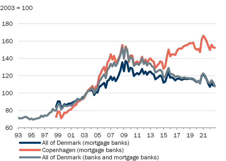
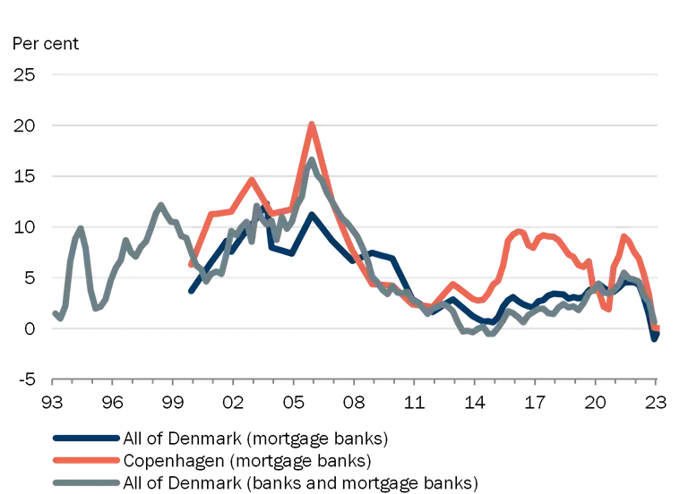
This risk dimension includes indicators of housing loans relative to disposable income and lending growth (housing).
Intuition: Losses in crisis periods often relate to loans granted in good times. Strong lending growth may entail that the credit assessment process is not sufficiently thorough. High lending relative to income may indicate that less importance is attached to the borrower's ability to repay the loan as the value of houses, and hence the collateral pledged, increases.
| Housing credit |
Chart 4 |
| Housing loans relative to disposable income |
Lending growth, housing loans |
|
|
Note: Seasonally adjusted. The most recent observations are from the 4th quarter of 2022.
Housing loans are defined as debt to banks and mortgage banks for housing purposes in kr. billion (for Copenhagen city only lending by mortgage banks due to lack of data). In the left-hand chart, the denominator includes disposable income for all individuals in the area in kr. billion. The time series are affected by the early payment of holiday funds in the 4th quarter of 2020.
Source: Danmarks Nationalbank and own calculations based on microdata from Statistics Denmark.. |
2.4. Empirical models
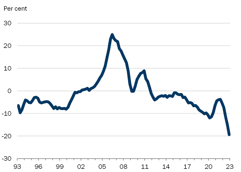
This dimension includes indicators of the spread between actual and model estimated house prices, as well as statistical bubble indicators for real house prices.
A large spread between actual and estimated house prices based on the development in fundamental factors may indicate unsustainable price developments, which may have systemic consequences, cf. also 2.2 above.
| Empirical models |
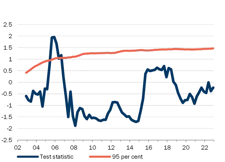
Chart 5 |
| House price relation, actual vs. estimated |
Bubble test of house price index (Copenhagen city) |
|
|
Note: Seasonally adjusted. The most recent observations are from the 4th quarter of 2022.
Left: Percentage deviation between estimated and actual house price rate (change in logarithm to real house price). 4-quarter moving averages. For Copenhagen city, prices for owner-occupied flats have been applied; for Denmark overall, prices for single-family houses. See the descriptions of the house price relation in Dam et al. (2011) Developments in the market for owner-occupied housing in recent years – Can house prices be explained? Danmarks Nationalbank, Monetary Review, 1st Quarter, and in Hviid et al. (2016) Regional aspects of the housing market, Danmarks Nationalbank, Monetary Review, 4th Quarter.
Right: Test sizes and critical values in Danmarks Nationalbank's bubble test of house price index (shown for owner-occupied flats in Copenhagen and adjusted for fundamental factors). If the test size is above the critical value, the test indicates "bubble-like" real house price increases with a significance level of 1, 5 and 10 per cent. See the description in Hviid (2017) A leading indicator of house-price bubbles, Danmarks Nationalbank working paper no. 114.
Source: Danmarks Nationalbank. |
[1] https://systemicriskcouncil.dk/media/7025/dsrr15-discussion_paper_eng.pdf
[2] See e.g. Danmarks Nationalbank, Monetary Review 2016, 4th Quarter.
Appendix 1 – Sensitivity to changes in time periods
For Denmark overall, a heat map with data back to 1981 can be constructed. As shown in Chart B1, the use of longer data history does not lead to a different conclusion in relation to the temperature of the housing market at present (two yellow risk factors while the rest are green).
| Heat map with long history (All of Denmark) |
Chart B1 |

|
Note: See Chart 1. Indicator names omitted for space reasons. Long history only available for all of Denmark.
Source: Danmarks Nationalbank, Statistics Denmark, Association of Danish Mortgage Banks and own calculations. |
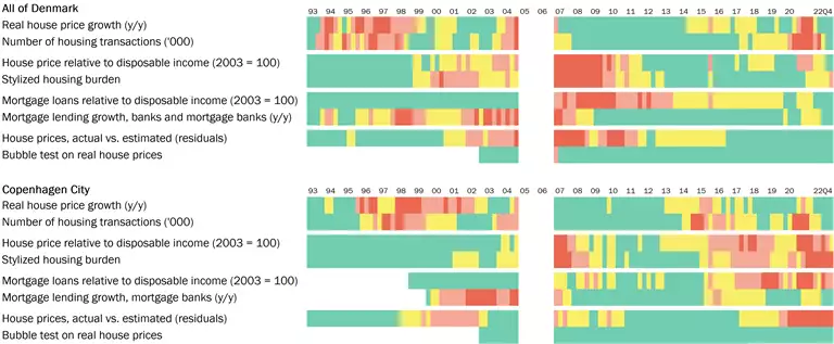
Chart B2 shows the heat map if the eight quarters in 2005 and 2006 are omitted. For Denmark overall, the conclusion is the same as for the full heat map shown in Chart 1. But for Copenhagen city, leaving out the extreme observations means that the heat map shows an even stronger reaction. Thus, the indicator for house price relative to disposable income also turns red, while lending growth changes from yellow to orange.
| Heat map with 2005 and 2006 omitted |
Chart B2 |
|
Note: See chart 1.
Source: Danmarks Nationalbank, Statistics Denmark, Association of Danish Mortgage Banks and own calculations. |
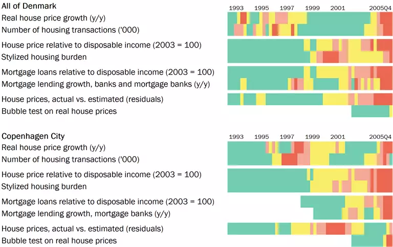
To test whether the heat map would react strongly just before the financial crisis, Chart B3 shows the heat map with the 4th quarter of 2005 as the latest observation. There are relatively few observations, so caution should be exercised when interpreting the results. However, the heat map reacts as expected.
| Heat map with 4th quarter 2005 as latest observation |
Chart B3 |
|
Note: See chart 1.
Source: Danmarks Nationalbank, Statistics Denmark, Association of Danish Mortgage Banks and own calculations. |